

The first step to any good research is to use the app yourself especially if you fit the criteria as a user. On day one I downloaded the app and started exploring the ins and outs. The apps was very extensive so I built a sitemap to give an high level overview of what the app entailed.
Sitemap

Competitive Analysis

User Research
I also needed to figure out who my users were so I could interview the correct folks. To do this, I first sent out a screener using Google Forms to various social media platforms to gauge who works out and who doesn't. From there, I then sent out a survey to gauge why they do what they do and how they do it. To the right you can see the format that I used to get in touch with the correct user-base.
To gain an idea of where Under Armour sat in the industry I screened the competition using Google as well as an various app stores. I deciphered who our competition was, how much of the market they owned and what their users enjoyed about their app.
Key takeaways:
-
Under Armour has all the tools necessary to become a leader in the digital tracking community.
-
Under Armour has a lot of standing out to do.
-
Fitbit is currently leading the digital tracking community.

-
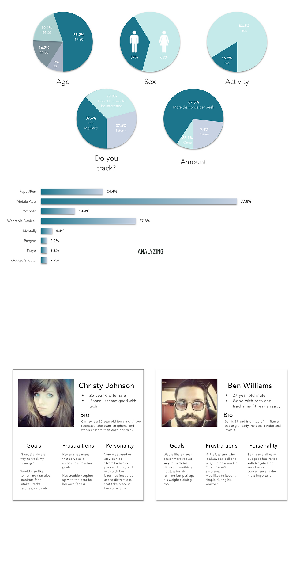
Majority between age 17 to 30
-
Majority Female
-
Majority Active
-
Majority work out more than once per week
-
Almost even split between people that track their fitness, people that don't, and the people that would like to
-
Majority track their physical activity
-
Majority track using a mobile app
The results above allowed me to create the personas below. These personas would be used to personify to the client who the majority of our users were. This in-turn, would help us maintain perspective.
Persona Creation
From 2005 to 2015, Under Armour has invested over $700 million dollars to make themselves known in the fitness tracking industry. Today, Under Armour Record is their end-all-be-all app that houses all of their other tracking apps under one roof. My job was to apply simply UX fundamentals to see how I could improve Under Armour Record

Affinity Diagram
Due to the vast amount of pain points uncovered, an Affinity Diagram became necessary for me to understand what issues were the most important to tackle. It quickly became apparent that convenience was the most important factor for our users. That said, the new design needed to be as convenient and as easy to use as possible.

Convenience was the most important to our users and during user testing we discovered that users didn't enjoy seeing activity being tracked that they didn't care to see. Because of this, it was decided to tackle the onboarding process beyond just giving the app an overall facelift. By allowing our users to choose their activity during the onboarding process, this in-turn would allow the app to only display what users care to see.
Wireframes/Mockups


During interviews I discovered that users are often comfortable with what they currently use and would need to be provided a reason to switch from their existing app to Under Armour Record. Because of this, I came up with an idea to utilize Under Armour's unique position in the clothing industry to give users a reason to leave their existing app. This idea was to give users access to exclusive clothing by being the top # of users in their category. For example, the top 100 get access to Alpha Armour. This way fitness enthusiasts are rewarded and recognized for their achievements at no cost to Under Armour. Additionally, it provides a reason for users to purchase Under Armours tracking gadgets.
To date, I've ran this concept by 3 gym managers and 24 personal trainers in my area and have received nothing but 100% positive support for this idea.
Enhancements

